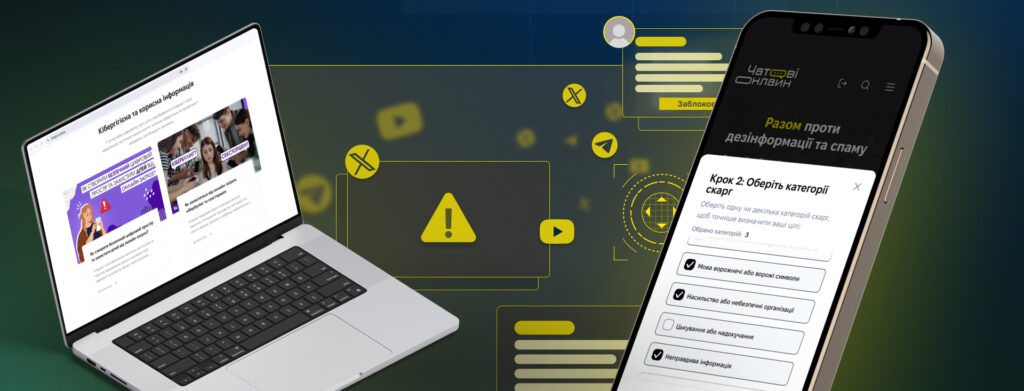
Чатові Онлайн — платформа, яка допомагає боротися з фейками, кібербулінгом і шкідливим контентом у соцмережах. Це частина цифрової екосистеми BRAMA, яку розвиває кіберполіція разом із партнерами.
Як усе почалося
Ще до повномасштабного вторгнення Департамент кіберполіції Національної поліції України створив ініціативу “MRIYA”. За її допомогою, боролися з торгівлею наркотиками через Telegram-бот “Mriya”. Після 24 лютого 2022 року потреби змінилися — і бот перетворився на інструмент для боротьби з ворожою дезінформацією, фейками та пропагандою. Згодом проєкт масштабували в повноцінну вебплатформу.
Ідея полягала в тому, щоб надати користувачам не просто можливість скаржитися на підозрілий контент, а й інструменти для навчання, залучення та цифрової самооборони
Чатові Онлайн має дві основні частини
💡 Освітнячастина
Вона допомагає людям розібратися, як безпечно поводитися в інтернеті, розпізнавати фейки, пропаганду та шахрайство. Є курси, блоги й опитування, пройшовши які користувач отримує сертифікат та неоціненні знання з медіаграмотності й кібергігієни.
👩💻 Практичначастина
Робота сайту базується на координованих масових скаргах активістів на шкідливий контент. Користувачі надсилають підозрілі матеріали, модератори це перевіряють, запускають в роботу і далі всі охочі можуть надсилати скарги на ці матеріали.
Що всередині платформи
Разом із фахівцями кіберполіції Onix Team розробила функціональну, безпечну та доступну платформу з такими можливостями:
Освітній хаб
Освітній центр побудований на базі LMS (системи управління навчанням). Користувачі можуть проходити курси з медіаграмотності та цифрової гігієни, складати тести й отримувати сертифікати.
Повідомлення про шкідливий контент
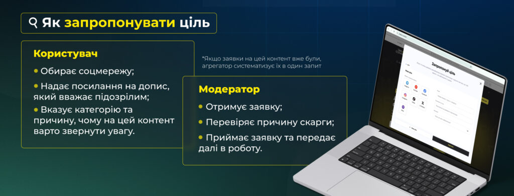
Кожен користувач може надіслати скаргу на фейковий або підозрілий контент. Посилання супроводжується коротким коментарем, і заявка потрапляє до модерації.
Система агрегації
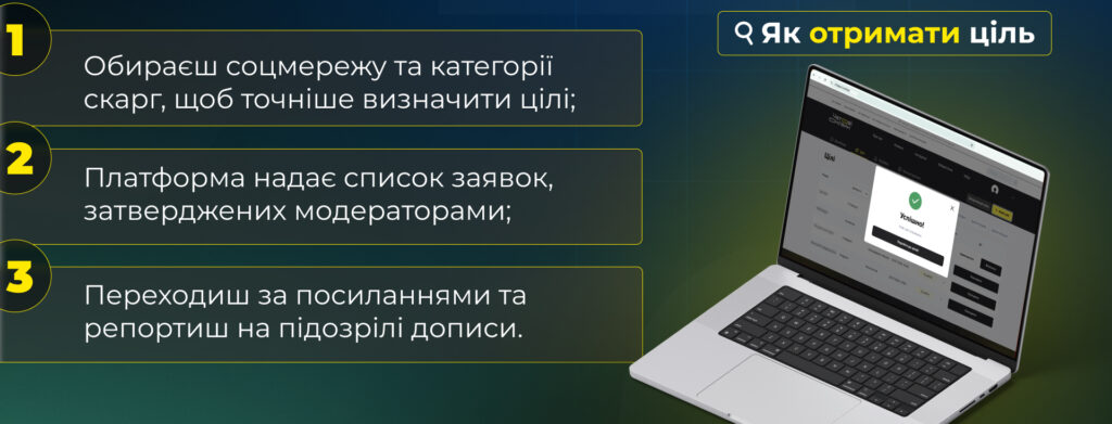
Якщо кілька людей надсилають скарги на той самий матеріал, система автоматично об’єднує ці повідомлення в одну заявку. Це спрощує та пришвидшує модерацію.
Адмінпанель для модераторів
Модератори переглядають скарги, змінюють їх статус, запускають у ротацію та стежать за динамікою обробки. Система дає змогу зручно керувати потоком заявок.
Дашборд для активістів
Користувачі бачать власні заявки, їхній статус, отримують посилання для скарг у соцмережах, відмічають контент як заблокований.
Гейміфікація
Платформа має систему рейтингу учасників. Рівень залежить від часу, проведеного на платформі, а також від кількості заявок. Ця система не має функції змагання, проте мотивує користувачів повертатися, допомагати та залишатися частиною спільноти.
Інтуїтивно зрозумілий інтерфейс
Простий дизайн дозволяє швидко розібратися, як усе працює та зосередитися на головному.
Результати
З моменту запуску платформи тисячі активістів долучились до боротьби з фейками. Завдяки скоординованим масовим скаргам вдалося зупинити поширення сотень випадків пропаганди, булінгу та шахрайства в Telegram, Facebook, YouTube, TikTok, Instagram та X.
Зараз Чатові Онлайн — це не просто інструмент. Це рух за безпечний, чесний і відповідальний цифровий простір.
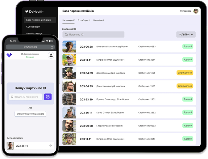
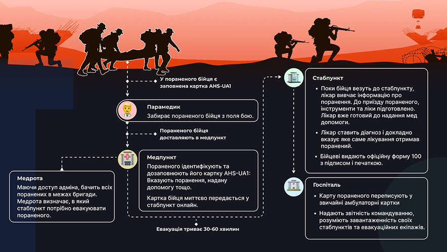
Onix Team долучилася до розробки цифрової військово-медичної системи, яка допомагає рятувати життя та покращувати здоров’я військовослужбовців – застосунку Army Heath System!
Army Health System функціонує як вебзастосунок та цифрова карта пацієнта (DeHealth ID) й забезпечує безперервний доступ до медичної інформації військовослужбовців. В майбутніх оновленнях реалізують аналітику здоров’я на основі штучного інтелекту. Наша команда працювала над Frontend частиною розробки.
Що всередині Army Health System?
✅ Система відстеження здоров’я солдатів ✅ Військова медична карта пацієнта ✅ Аналіз здоров’я на основі штучного інтелекту (планується)
10 000+ активних користувачів у військових спільнотах.
У 2 рази швидша продуктивність зі Svelte, порівняно з традиційними фреймворками.
Триває розробка функцій штучного інтелекту для автоматичного виявлення ризиків для здоров’я.
Army Health System має на меті покращити комунікацію серед військових медиків та командування, зробивши обмін медичною інформацією миттєвим та безбарʼєрним. Адже недостатність комунікації чи затримка в процесі надання медичної допомоги, може коштувати нашим військовим життя на полі бою.
Система для військовослужбовців Army Health System побудована з використанням технологій DeHealth ID, які забезпечують безпечне та децентралізоване зберігання медичних даних, що відповідає GDPR, HIPAA та Закону про захист даних.
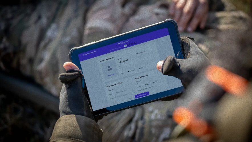
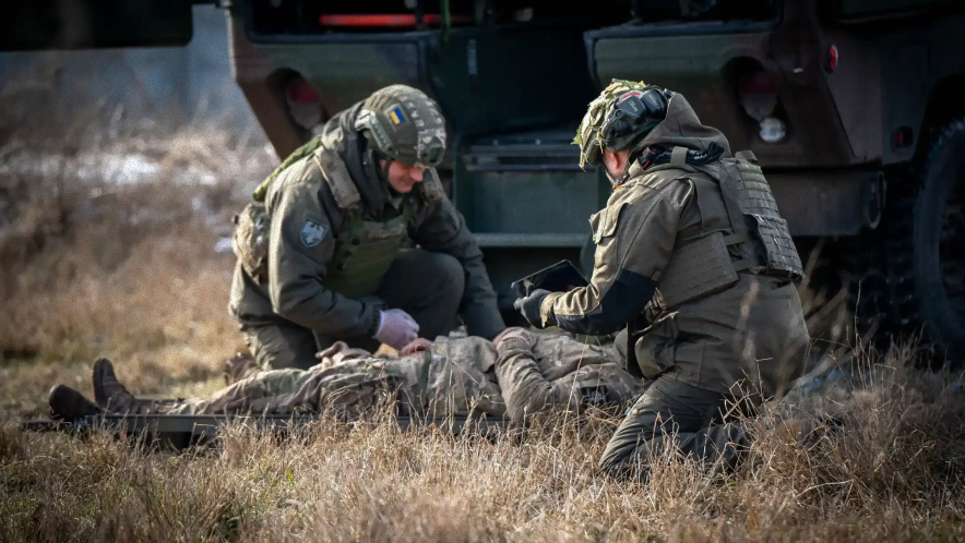
Застосунок функціонує як progressive web app, тому його не можна знайти у вільному доступі. Наразі, застосунком вже користується 91-й протитанковий батальйон.
Тестування Army Health System в польових умовах. Фото: 91 окремий протитанковий батальйон
Rename.kr.ua is Onix-Systems’ pet project. It started with a small team:
Bohdan Stasyuk – co-author who also prepared the information about the renaming of streets
Dmytro Durach – co-author, organizational support of the project
Maksym Sinchenko – collection of information about the streets
Serhii Kholin – management
Kostyantyn Altukhov – development
Kostyantyn Svidzinskyi – design
Open data is one of the project’s key ideas. The site engine is publicly available. Anyone can replicate it and create a similar service for their city. The site also features an API one can call to get all renamed streets’ info in a JSON file to be used in other services if needed.
How Rename.kr.ua was created
The website creation was triggered by the decommunization campaign in Ukraine. As the renaming of urban places and streets unfolded, keeping up with the changes became increasingly difficult. Map services often failed to find the necessary address or display street names correctly.
The citizens of Dnipro were the first to understand the need for an online street directory. In 2015, they initiated the creation of Rename.dp.ua after the city authorities approved renaming over 300 objects in several days.
A similar process was only beginning in Kirovohrad (the former name of Kropyvnytskyi). Bohdan Stasyuk, a local history enthusiast, and Onix’s CEO Dmytro Durach decided to create a similar service for our city.
Dmytro introduced Bohdan to Serhii Kholin, Onix’s COO, who ended up managing this project. Bohdan Stasiuk took on the content curation task. Maksym Sinchenko helped him with the most tiresome work – gathering information about persons after whom the streets were renamed. Kostyantyn Svidzinskiy took on the website design, and Kostyantyn Altukhov – the programming.
We created a repository on February 24, 2016, and began building the website. The development took one month. “The company was much smaller back then, so just a couple of desks separated the two Kostyantyns,” Serhii Kholin said.
The main requirements for the website’s design were convenient content consumption and rendering the city’s atmosphere. “The directory was basically a big list, so we needed to simplify its visual perception,” Maksym Kamenshchikov, Onix’s Art Director, explained.
The smart use of colors, fonts, and space between the elements helped achieve a lighter UI design. Improvements to the user experience (UX) included adding autocomplete search and alphabetical order. It enabled people who might not remember a street’s full name to find the desired address quickly.
Rename.kr.ua 2.0
The first decommunization campaign involving street renaming lasted a year and a half. The site was actively populated and used by the townspeople. When the renaming process slowed down, the site continued to run on its own, only requiring support occasionally.
Rename.kr.ua got a new lease on life in early 2022 when the city saw a new massive wave of street renaming.
Volodymyr Gordienko, head of the PHP department, explains: “In February 2022, Serhiy Kholin told me that the website needed our support. It was technically outdated and did not work as fast as we wanted. Administering it had also become troublesome. We decided to build a new service from scratch.”
“We chose PHP/Swoole, an excellent technology, built a new back-end, and implemented modern deployment systems. In short, this made the developers’ lives easier. Then we added an admin panel, online map, feedback system, and other features,” Volodymyr said.
Currently, Rename.kr.ua sees about a hundred users per day. Volodymyr Mikhav oversees its work, as he is in charge of the PHP department’s non-commercial projects.
The idea of an office map was brought up by a real problem our growing company encountered.
Finding one of 350 employees in an 8-floor office building like Onix’s may be challenging. “Alex B.? Well, on the 7th floor, in the left wing, you turn to the left, then to the right, and then… His was the third desk, I guess. You can ask someone on the spot.” – instructions like this should sound familiar to any big company employee. If you’re lucky, the first colleague you meet on the spot will tell you. Or not. And if you haven’t met Alex B. before, locating him in an open space isn’t an option.
Why we created the office map
When the map was envisioned, the number of Onix’s employees was significantly lower. The company’s office floors were few but not adjacent: the ground floor, the 5th, and the 7th. Finding a colleague would often equate to a mini-workout for those who hate elevators.
The creation of the map implied several capabilities for the employees:
Find a colleague and their workstation
View individual workstations in open spaces
View information about a colleague
2013: Start of the development. Solutions.
Onix team uses breaks between commercial projects to learn and test new technologies and create demos. Making an office map seemed both interesting and practical. At that time, everyone was discussing indoor navigation issues. We also considered several projects, one of which would employ iBeacon.
Thus, our work on the map began in July 2013. At that time, the project team
Drew in Photoshop the design of the premises in a pseudo-scale, several types of desks, and the boys and girls.
Used the Я.Карт engine to create the map. (This engine, which could be used separately on our server, enabled the developers to lock zoom, upload employee cards, and drag the map easily.)
Chose PHP as the back-end programming language.
Synchronized the employees’ data from the LDAP system.
Built a simple admin panel for the administrator to enter the employees’ workstations and arrange the desks of various types.
The map was only accessible via the office IP address and was closed to external users.
Even that simple, the office map performed its function, albeit with some difficulties. For example, someone had to monitor workstation changes and manually update the map accordingly. It also lacked advanced search, e.g., by skills and technologies, in addition to the first and last name.
Therefore, when Onix’s office space and personnel expanded, we felt it was time to update and improve the map.
2019: Version 2.0
In the fall of 2019, having collected our colleagues’ requirements for a new map, we set to work.
In fact, at that time, the colleagues only wanted to:
add to the map the floors the company acquired
add employees’ photos to their cards
quickly copy a colleague’s email or phone number (because we mainly communicated via Telegram) or promptly open the dialogue window in Skype
add technologies and employee roles, such as Project Manager, Tech Lead, React Developer, etc.
conveniently search by technologies and skills
However, appetite comes with eating, and once software developers find themselves in a customer’s shoes, they begin to love changes to the original project scope. So, the project team ended up doing a bit more.
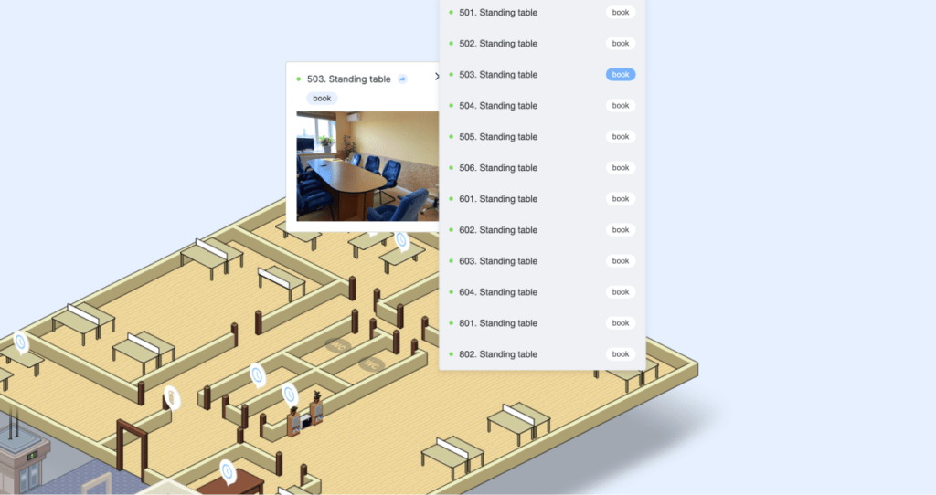
Meeting rooms and workstations
Before the pandemic, nearly all employees attended the office. And since their work often requires teleconferences with clients, the demand for meeting rooms was high. For colleagues to know which room is currently occupied and which is available, we decided to add the appropriate functionality to the map.
Firstly, we added real photos of the different rooms. The HR team painstakingly photographed each room in the office to give an idea of its size and capacity. Now it’s easy to determine which one of the 16 rooms is suitable for a specific conference with or without a team.
Secondly, we developed a room reservation functionality. All rooms were entered into a corporate Google account. When one reserves a specific time slot, one can choose one of the available rooms. A room can be booked not only from the calendar but also from its “profile” page. One should select “Reserve” on the room’s photo, and this option will promptly appear on the calendar.
Thirdly, we updated the map header to feature the quick room reservation for selected times. Users also can see when a room is available for reservation and when it is already occupied or booked.
It is also possible to reserve workstations in the office. This is helpful for colleagues who work remotely but come to the office occasionally and in the case of height-adjustable desks, which are still few in the office. The office map thus enables employees to reserve some of the workstations in advance.
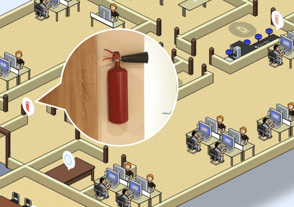
Safety of the office and people
The best way to show fire extinguishers’ locations is to mark them on a map. I confess I never paid attention to them, where they hang, and how many. So we organized a mini-quest “find all the fire extinguishers in the office.” The same about first aid kits.
I doubt anyone will be looking for a fire extinguisher on the map in case of fire. However, if one views the map regularly, one involuntarily gets to remember where they are. It is also convenient to show new employees the fire extinguishers on the map during onboarding.
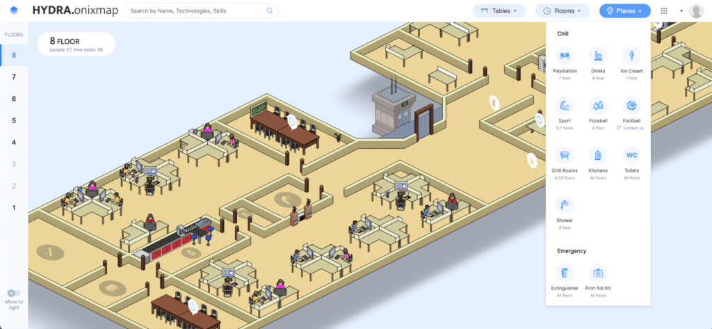
Locations
Office space is not only about work: there’s time and place for leisure with colleagues. Rumor has it that developers play Playstation at work… Let’s be honest: they do. They also play table football. Moreover, they play the guitar and bass guitar (yuck!), drink tons of coffee, eat ice cream in the lounges, and more.
There are many locations in our offices where you can catch them, but you won’t catch up with them if you never leave your workstation. Our office map helps familiarize new team members with Onix’s office; they can arrange a virtual tour and then go to see everything live.
Accessibility
Previously, the map was accessible only from the office IP address. However, during the pandemic, everyone worked remotely. By then, we had implemented a convenient search by technology and skills, levels of expertise (from novice to expert), and sorting by experience and birthday (we also send birthday greetings), so the office map became a popular instrument even outside the office.
So we integrated the map into Hydra, our company’s ERP, and implemented a common login. The map is now available to any colleague from anywhere in the world.
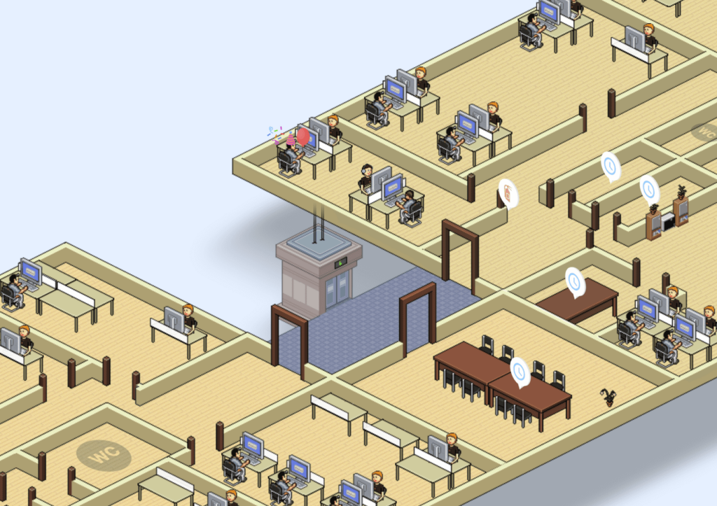
Workstations
A small office with some twenty desks hardly poses a numbering problem, not to mention the desk numbering logic. However, things changed with Onix’s office encompassing 8 floors and hundreds of workstations.
Stickers provided a solution. We came up with a smart way to mark all desks on one floor and repeated the procedure 7 times. To make it clear, stickers with numbers were placed on the desks.
Additionally, we enabled employees to change their workstation numbers in their profiles. If they moved to another desk, they change its number themselves. This solved the administrator’s problem of tracking the employees and workstations and updating the map.
A colleague who works remotely can also be found on the map. Instead of the workstation number, they have the “Remote” mark. After all, the map should provide helpful information regardless of an employee’s location.
P.S. Occasionally, e.g., on April 1, we have cats sitting, lying, and working at our desks! And birthday boys and girls have festive profile pictures with air balloons, confetti, and party hats.
Summing up
Our digital office map has long outgrown its navigation function. The best way to see it is to compare the initial requirements with the results we have now:
A convenient service integrated with the company’s ERP Hydra, which can be independent if needed. (Here’s a demo.)
Integration with Google Calendar to reserve meeting rooms and height-adjustable desks.
Each employee can make changes to their profile (photo, email, social networks, etc.), including changing their workstation.
Access for all employees via single sign-on (SSO).
Custom solution based on SVG instead of Yandex.map.
The back-end is written the latest PHP and the interface on the Vue.js framework.
Pseudo-scaled design that conditionally renders the dimensions and coordinates of desks and other objects.
Clickable zones to indicate leisure locations and objects.
Adaptation for convenient use on mobile phones.
Updated headbar with an advanced search, locations, company services, and option to book a meeting room or workstation.
Sidebar showing the floors for left-handed and right-handed users.
Multiple languages: the map is available in English and our beloved mother tongue.
Balloons and party hats on profile pictures for everyone to know whose birthday it is.